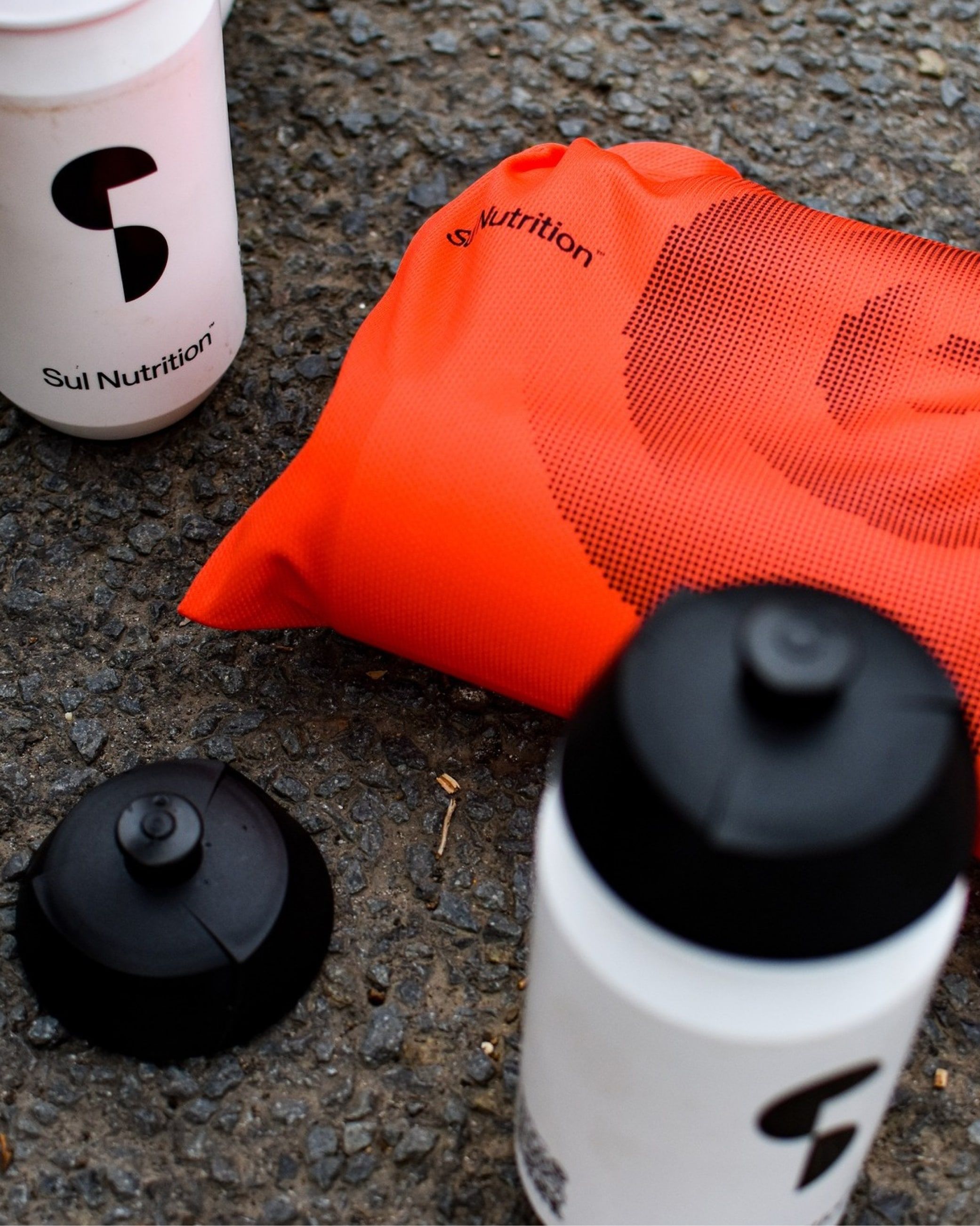
Brand identity for a
performance nutrition brand
Performance supplementation for endurance athletes. Sul Nutrition is taking the cycling world by storm — a complete identity built from the ground up across visual identity, packaging, motion, sound, and digital.
- Client
- Sul Nutrition
- Year
- 2024
- Scope
- Visual IdentityBrand Guidelines · Creative Direction · Packaging · Motion · Sound · Digital
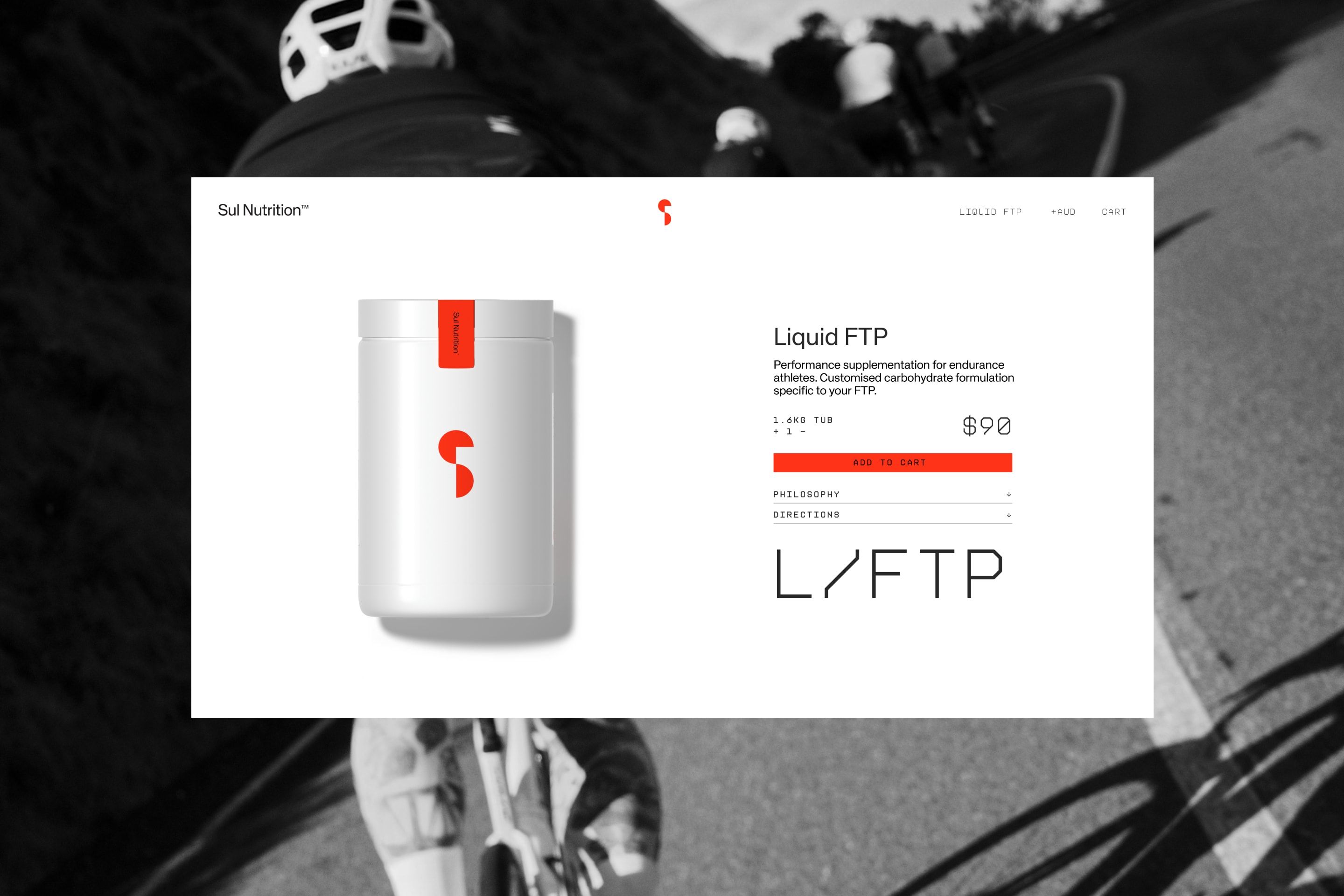
A system built on geometry and motion.
The Sul mark — two arcs in tension — translates across every surface. Sharp, functional, and built for speed. The identity draws from cycling performance culture: precision engineering, minimal weight, maximum output.


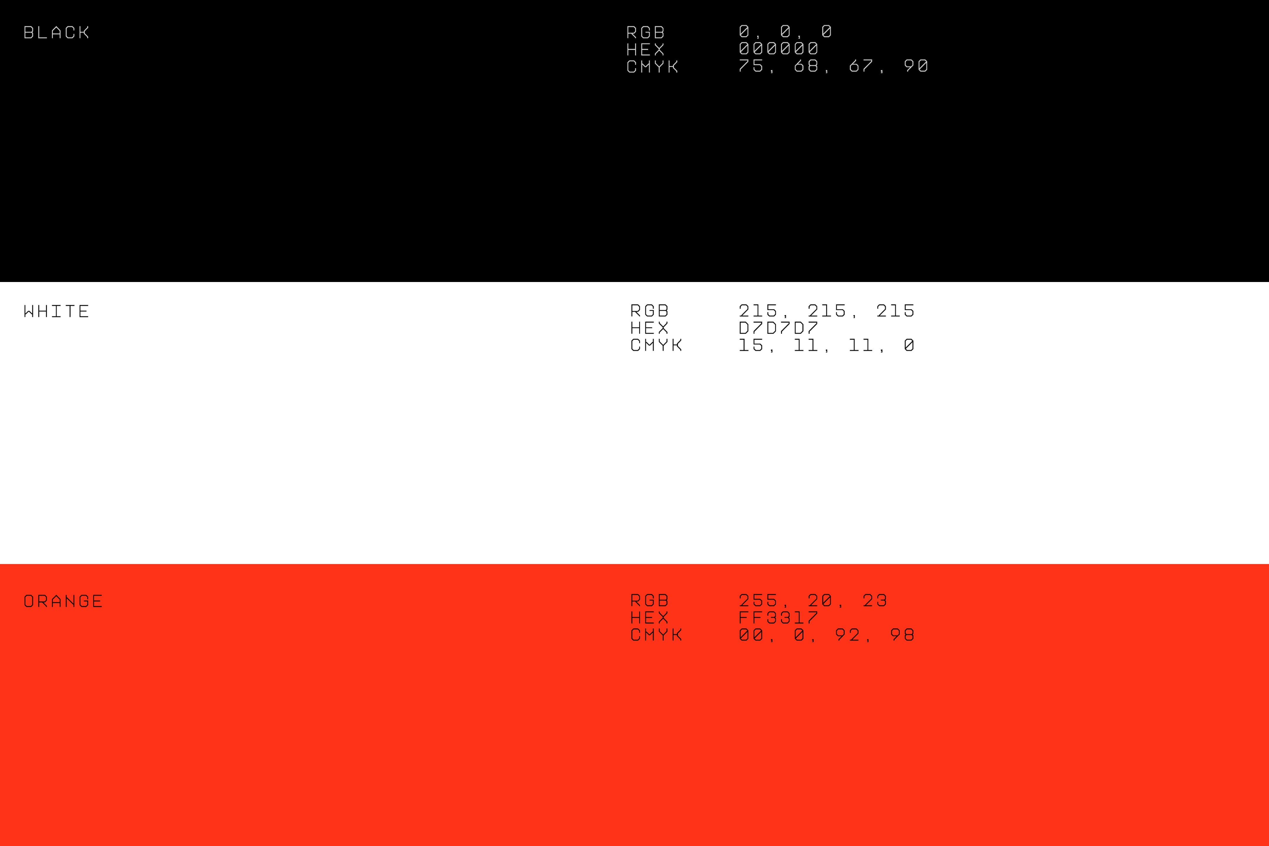
Type as performance data.
The typographic system uses a technical mono-spaced display face that mirrors data readouts and training metrics. Zone codes, FTP labels, and product naming all speak the same visual language — performance-first, athlete-legible.
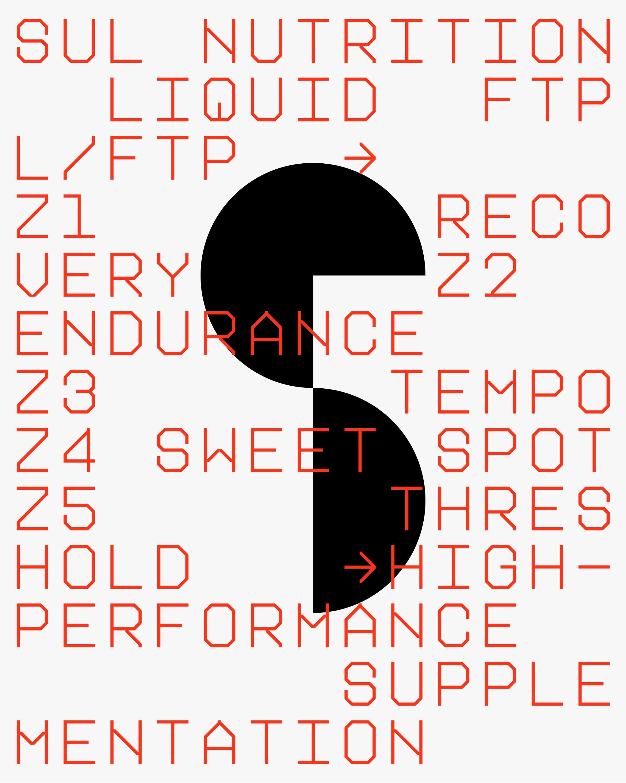
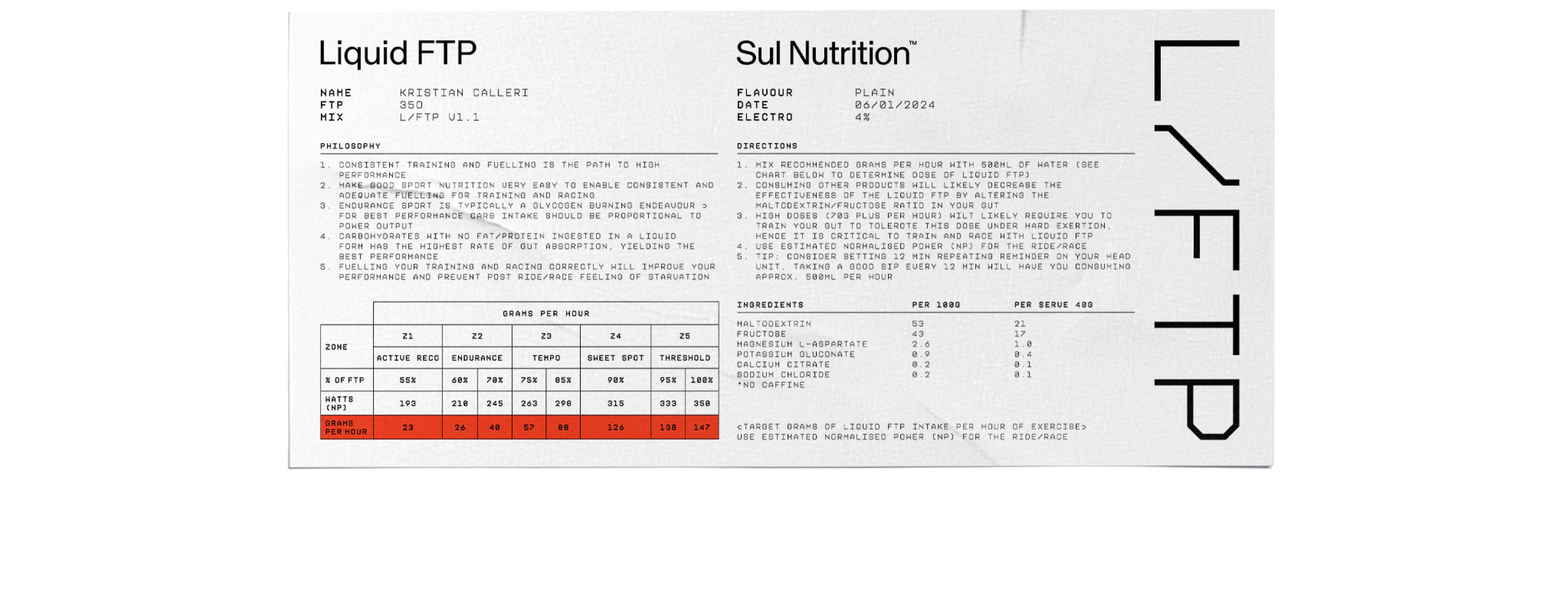
Packaging built for the road.
Every product touchpoint — from the tub to the jersey pocket sachet — carries the same system logic. Clean surfaces, a bold mark, and the Sul red as the single accent. Designed to perform at 200W just as much as at rest.